Showing posts with label homemade. Show all posts

Wednesday, 14 August 2013

Garoons!

Ahh! Double post! But I totally have to do this one before I go to the coast on Friday :D

A month or so ago Snow from Garoons held a giveaway. I'd never entered a blog giveaway before so didn't expect to win but I did! Yay! Here are the lovely things she sent to me:


When I return home I will take better pictures of the lovely necklace that she made (wow skill) and those wonderful socks (gosh I love socks).
 
Please visit Snow and send her lots of love from me <3

Monday, 5 August 2013

Undefeated - Drawing

This is the third and final part of my guide to creating your own short graphic story.

First let's do a checklist. Have you:
  1. Planned your story?
  2. Written your script?
  3. Left your script?
  4. Returned to your scripted and edited it?
  5. Designed your characters?
  6. Practiced drawing your characters until you're happy with easily recreating them?
Good. Then we can continue!

I drew Undefeated using a digital program (I'm an old school cheapskate so swear by Photoshop 7, DON'T use MS Paint) however wherever possible I'll also explain each step as if I was drawing the comic traditionally. I'll put the traditional bits in pink.

N.B. I'm not a professional artist. These are tips from personal experience. Anything that doesn't fit for you, don't do!

Step One

Make a rough sketch of what your page will look like on a separate piece of paper. If you are creating a short comic / graphic story with a limited page count like me you will have already done this in the planning stage. If your story has an open page count you probably won't have already sketched a plan. Sketching a plan is not so much about how each panel will look but the over all page layout - panel placement, text placement, etc - it is purely for you and as long as you understand your plan it is more than allowed to look completely rubbish and incoherent to everyone else!

Here is what my plan looked like (I drew all four page plans on one piece of A4 paper):


Step Two

Make your document size really big (nothing under 200 pixel resolution and 1500 pixel length / width). It's much easier to resize a picture down if it is too big than increase its size if it is too small. If you plan on getting your comic published publishers require digital copies to have big resolutions so as to not look pixelated when printed. Working big then sizing down later also makes it easier to draw finer details.

When drawing a page using traditional materials pick whatever size paper feels right for you or is specified by the publisher. Generally publishers don't like receiving work bigger than A3 (also it's really expensive to send something A3 or above in the post).

Step Three

Create a new layer and draw your panel lines. Never draw directly onto the background. Always create a new layer for each step / set of colours! Think of drawing with layers like drawing on tracing paper. Each digital layer is like a layer of tracing paper and whatever happens on one layer does not affect the others. By drawing on separate layers you do not ruin everything if you make a mistake. You can just erase the mistake on that single layer rather than everything above, below and around it.

When using traditional materials I'm afraid you don't have the safety net of layers however drawing lines is easy, just draw guide lines with a pencil before going over with ink.

At this point I also place my text boxes / speech bubbles (in separate layers) because I'm lazy and don't enjoy the idea of putting a load of effort into part of a panel only to cover it with text.

Once again you don't get the luxury of this choice when drawing traditionally. If you haven't placed your text by the time you start inking you're screwed!

Step Four

Make a new layer and sketch in the design for your final picture / pencil your design.

It should look something like this:

 
Step Five
 
In a new layer 'ink' your lines. By ink I mean go over your sketch lines with a smooth black line. This is what your final lines will look like so take lots of time with them to make sure they're right. You won't want to be redrawing things once you start colouring. I mean it's completely possible to redraw your lines once you start colouring (and even I do it when I realise I've made a terrible mistake) but it's really inconvenient and I'm all about making this process as simple as possible.
 
Though it takes lots of practice try to draw your lines in single strokes rather than feathering then trying to smooth with the eraser. If you find it hard to draw smooth lines when your document is zoomed to its actual size try drawing whilst zoomed into 200% - I find it produces much smoother lines.
 
You may feel more comfortable drawing the background lines on one layer and the foreground lines on another. That way if you make a mistake it is less likely to affect the rest of your lines.
 
Once you've completely inked your page you can delete your sketch layer / reduce it to 0% opacity.
 
When inking traditionally take lots of time and have lots of patience.  You get one shot at this and you don't want to mess it up. There are such things as Tipex / liquid paper but any sort of correctional fluid will always show up (which is why people usually use it to add highlights rather than to correct mistakes).
 
Let areas dry before moving on - the last thing you want is to smudge the ink with your hand - and when drawing with a ruler lift it onto its edge when lifting it from the paper, don't drag it across the paper as it may drag the ink with it.
 
Try not to erase your pencilling until you've completely inked your page. Also try not to press too hard with your rubber / eraser. Too much rubbing will also remove the ink.
 
Your inking should look something like this:
 
 
Step Six
 
Using a new layer for every colour (or texture style if working in black and white) apply your base colours. Because you are drawing on separate layers the fill tool won't work - you have to scribble like colouring in a colouring book page
 
You'll probably create lots of layers at this stage so it's a good idea to name them as you go.
 
Colour in / shade, once again taking your time. Work on each panel as though it is its own piece of art rather than trying to colour all the page in one go.
 
Your page should now look something like this:
 
 
Step Seven
 
Shade your work, once again creating a new layer for every colour. Not being a pro I don't want to tell you my way of shading like it is THE way of shading however here are some basic things that I do:
  1. I always decide where my light source is before I start shading
  2. I never use the burn tool
  3. I make one layer where I use a slightly darker version of the base colour to draw shadows then make a second layer where I use an even darker version of the base colour with the gradient tool (fading to transparent) to create an overall sort of dark glow. (This will be clearer from the example image!)
  4. I keep a sample of the colours I use to shade so that the colour palette is uniform for each panel / page. Once the gradient layer has been added it tints everything and you'll never be able to properly recreate your original colour choices.
Once you have shaded and added any highlights your finished page will look something like this:
 
 
General tips:
  1. Every so often take a break. Mistakes happen when you overwork yourself and carpal tunnel syndrome happens when you keep your hand clenched for too long.
  2. If you find you're not having a good drawing day don't force it. Go clean the toilet and come back and try again.
  3. Don't draw drunk / high / with a fever. You may think it makes you cool or an 'artist' but unless you're an absolute genius your work will look rough and generally crap.
  4. I draw wearing a fingerless glove so as to stop my fingernails from biting into my palm. It makes you look like a super villain too XD
  5. When working digitally the colouring stage can get really boring so definitely feel free to listen to music as you work. If you get bored of music listen to something entertaining but bland such as a Murder She Wrote marathon or all of BBC iPlayer's backlog of Bargain Hunt. Don't listen to (watch) anything that requires you to actually pay 100% attention to it such as a film you've been dying to see for ages or You've Been Framed.
  6. When working with traditional mediums you may also get bored but don't be tempted to put on the TV! That is the instant road to making an irreversible mistake. Listen to calming music and if you get bored of your music listen to a radio drama / audio book. I especially recommend Radio 4 Extra's horror, fantasy and sci-fi section. If you come from a country which no longer makes radio drama you can listen to Orson Welles' wonderful radio dramas (including that infamous War of the Worlds recording) here. You can also listen to a podcast but don't pick one that will excite you too much or that your are desperate to listen to as you're more likely to make a mistake again.
  7. And the obvious one...don't leave drawing your comic to the last moment.
Well done. You have just completed a short graphic story and got one step closer to drawing that five volume Batman epic.

Thursday, 18 July 2013

Recipe: Pimms / Mojito / Chai ice cubes


What a summer, eh? Fruit seems to go off the moment you buy / pick it and everything's all hot and sticky! So here are my solutions:

Pimms ice cubes

Pimms No. 1 is a gin based 'fruit cup' liqueur which is very popular in the summer in the UK when mixed with lemonade and fruit. It is great to share at a party / picnic / BBQ but not so fun to have on your own because you usually end up omitting the iconic fruit (you don't want to buy a whole punnet of strawberries just to use one / a whole lemon just for one wedge etc) however if you have these cubes waiting in the fridge / freezer you can still enjoy the full Pimms experience whenever you want!

These cubes also go nicely in almost any other fruit cocktail. If you don't drink alcohol a good alternative to Pimms is Schweppes' Summer Punch. I've also been drinking them in non-alcoholic grape juice and my morning fruit juice.

You will need:
  • An ice cube tray
  • Ripe Pimms fruit (I used one strawberry and one grape per cube section but the other Pimms fruits such as one orange slice, lemon slice, apple slice, cucumber slice, mint leaf will also do)
  • Water
  • A fridge / freezer

Make sure your fruit fits the centre of each ice cube section. You will probably have to cut your strawberries in half (these were the last of my home grown strawberries so were small enough to go in whole). If your fruit is too big and touches both walls of the ice cube section it will make it really difficult to get your ice cube out when frozen! Trust me!

If you are using lots of different types of fruit don't squeeze too much in or the cubes will never come out! I'd say three pieces of fruit is the most you should put into each cube section.

Top up the cube sections with water (though not completely to the top as that will also make them hard to get out) and put into the fridge / freezer to freeze.

When set break into a glass, add Pimms (about 1/3 Pimms to 2/3 lemonade) and enjoy!

 
Mojito ice cubes
 
A variation on the Pimms cube is the 'mojito' cube. These ice cubes also go nicely in other fruity cocktails and non-alcohol fruit drinks.
 

You will need:
  • An ice cube tray
  • One half slice of cucumber per cube section
  • One half slice of lime per cube section
  • One sprig of mint per cube section
  • Water
  • A fridge / freezer
Follow the same method as for the Pimms cubes.

Chai ice cubes

My final variation is designed to go into iced coffees, iced teas (milk or herbal) or plain milk to add an extra twist of spice. I wouldn't recommend adding them to chai tea itself as they will make it too strong.

You will need:
Fill the ice cube tray with water or milk (water will dilute your drink whereas milk will make it taste creamy). Obviously if your drink was not milk based to begin with don't use milk for the cubes or it will make your drink go all cloudy and weird.

Stir into each ice cube section 1/2 - 1 teaspoon of chai tea mix (if you want a subtle flavour use less, if you want a fuller flavour add more). Powdered tea mix works better as it will infuse better with a cool liquid. If you wanted to be really sure the tea flavour infused you could heat your milk / water with the chai tea mix first.

Put into the fridge / freezer to freeze then when the cubes are set break on top of your favourite iced coffee / tea and watch the little particles of chai mix with your drink as the cubes melt.


Wednesday, 15 May 2013

A Selection of Japanese Craft

Whilst in Japan I was very lucky to not only learn about wasabi but also take part in various traditional crafts.

Washi Paper

Wa means Japanese and shi means paper. It is a traditional paper made completely by hand (as you can see in the picture below). It is made by stripping, drying and pulping together the fibre from the gampi tree, the mitsumata shrub, the paper mulberry and the tororo plant. The pulp is put into a big vat and the paper maker dips screens into the vat to produce the sheets of paper. The sheets are then pressed and dried.


Here are the sheets of paper my mum and I made:
 
 
Calligraphy
 
There are five styles of Japanese calligraphy. The character I produced is in the kaisho / regular script style (a formal style). Japanese calligraphy generally involves black ink, a brush, washi paper, a weight to hold the paper down with and a name seal. There are three main types of brush strokes (all of which you can see in my character). The first stroke is one where you press down at the beginning and the end of the stroke, the second is one where you press down at the beginning and trail off the pressure as you reach the end and the third is where you press down at the beginning and flick at the end (but not too much). Unlike writing you must have a rigid arm and hand. You must hold the brush 90 degrees to the paper. To generate the variety in strokes you have to be very confident - pressing lightly will produce thin lines which are not very aesthetic.
 
This character is wa which we now know means Japanese. It also means harmony. (I don't think the photo could be any more unflattering if it tried).


Tea Ceremony

Traditional tea ceremonies last up to six hours and not only include tea but a whole meal. They are very formal affairs with many rules. The green tea used is the bitter matcha tea. The matcha is whisked into the hot water rather than infused. To make the tea more palatable it is served with very sugary sweets. Sweets, bowls and kimonos are all carefully chosen to reflect the season the ceremony is taking place in eg in spring petal patterns in pink are preferred. People are allowed to talk during the ceremony at certain points however subjects must be peaceful ones such as the weather rather than ones that could cause arguments such as politics. If you are given a bowl to drink from with a pattern on which has an obvious front and back you much turn the bowl so that the pattern faces away from you to honour the pattern, your host's decision to pick it and the person who made it.

Here is an example of a spring tea ceremony sweet on a traditional pottery plate:


I also took part in an origami lesson (I made a box and samurai hat) and an ikebana (flower arranging) demonstration.

Origami is paper folding. Proper origami does not use tears or scissors and uses only one piece of paper. Here are some simple origami patterns for you to try.

Ikebana is incredibly complicated and takes years to master. The two main differences between Japanese and Western flower arranging are: 1) whereas Western arrangements are meant to be viewed from all angles ikebana has a back and front, 2) ikebana is as much about the negative space between the plants as the placement of the plants themselves - less plants are used and therefore much more importance is placed on the individual plants that are used in ikebana compared to Western flower arranging.

Here is a video that explains the basics of ikebana:


Tuesday, 30 April 2013

Undefeated - Character Design

This is part two of how to make your own short comic (I bet you'd thought I'd forgotten this didn't you?) The observant of you will have noticed the project title has changed to Undefeated. That is because between times I had a good think about the kind of stuff Comica / Cape / Observer might go for and decided though I still like my original idea this one would be more fitting for their competition.

Anyway - character design! This is a page of designs for Michael the main (and only) character from Undefeated.


There are two main reasons for drawing character sheets for your characters:
  1. So you can experiment with their physical characteristics and clothing before you start drawing. This is so important if your character is to have a uniform / costume. The last thing you want is to draw a page / chapter and realise you don't like the design. Its going to be a hell of a long time (if any) before you can write in a suitable reason for a look change. This is less important if your character wears everyday clothes - they can wear different clothes every day - but I would strongly advise not changing your characters' looks too much (and not changing their physical appearance at all unless actually part of the story) if you are writing a short graphic story such as my four pages. Your reader needs to connect with your character instantly - it just won't happen if they keep changing, like it wouldn't happen if they kept changing personality.
  2. So you can get used to drawing them. Nothing shouts unprepared / inexperienced than characters that have unintentionally changing hair length / jaw shape / eye size / height etc.
There are no rules on how many character sheets you need to do. Do as many as it takes for you to feel comfortable with drawing them.

Don't just do head sketches (as tempting as it is). Head sketches are really important as they are a great way of drawing your characters' expressions but you also need to know what the rest of their body looks like! Also remember to vary the angles that you draw your characters from. You won't always be drawing your character face on so you need to get used to what they look like from the side / behind.

There are also no rules on what medium you use to draw your characters with. These sketches are, after all, just for you. e.g. I never usually draw with colour pencils however they felt right for Michael. What I would suggest though is that at some point you practice drawing your characters in the medium you plan on drawing your comic in. I planned on drawing my first idea digitally so I drew the character sheets 100% digitally. Here is the beginning of one:


Well done! You are now ready for stage three...drawing your graphic story!

Sunday, 28 April 2013

Recipe - green tea and kiwi cupcakes with a lime and white chocolate glaze

This recipe is inspired by my visit to Japan and Hong Kong and will make 12 cupcakes. It works (and looks) best with matcha however if you don't have matcha loose green tea or the contents of a green tea teabag will do just as well.


Ingredients
125g butter / butter alternative
1/2 tsp vanilla extract
150g caster sugar
2 eggs
75g dried kiwi
150g self-raising flour
60 ml milk
1 tsp matcha / green tea
100g white chocolate
A large lime

Optional
Green food colouring

Method
  1. Preheat the oven to 170oC / 150oC (fan-assisted) / gas mark 3.
  2. Beat the butter, vanilla, sugar and eggs together until light a fluffy.
  3. Chop up the dried kiwi pieces so that they around 1/2cm long and stir in.
  4. Sift in the flour.
  5. Infuse your milk with your matcha / green tea by adding it to then milk and gently heating. Do not let the milk boil or catch! Leave it to cool then add to your mix (if you used loose tea strain the milk first). If you didn't use matcha but would like that green look you can add a few drops of green food colouring.
  6. Divide the mixture into your cupcake cases and bake for 35 minutes or until golden.
  7. Leave to cool on a rack.
  8. Grate the rind from the lime and then juice half of it (use the other in a cocktail or something equally glamorous...I picked a Moscow Mule).
  9. Melt the chocolate in a bowl over a pan of warm water. Don't let the water boil and don't let the water get into the chocolate. Add the lime juice. It will seize and go grainy but if you keep stirring (I used a whisk for this bit) it will return to a liquid form.
  10. Let the glaze cool for a bit then apply to the cooled cupcakes.
  11. EAT AND ENJOY.

Tuesday, 26 March 2013

Recipe - Oh No! Avocado! Guacamole

I'm going away for a few weeks so here's something for you to do whilst I'm gone. It's called 'Oh No! Avocado!' because I always buy avocados in groups and either get bored by the time I get to the last one or out right forgot I have one left and it gets over ripe etc. I like this recipe because it is more flavoursome and filling than shop bought guacamole.

Ingredients (makes one portion per avocado)
1 ripe avocado
1 1/2 tbsp lemon / lime juice
salt
1 diced medium red onion
1 diced medium tomato

Optional extras
1 handful fresh herbs (eg coriander, chives)
jalapenos / chilli sauce
diced cooked chicken
diced hard boiled egg
tortilla chips
granary bread / bruschetta

Method
  1. Halve the avocado, remove the stone and scoop the pulp into a bowl.
  2. Add the lime / lemon juice and salt and mash until most of the pulp as gone smooth but there are still chunks.
  3. Stir in the diced onion and tomato. If you don't have red onions you can use spring onions (otherwise known as scallions / salad onions). If you prefer really smooth guacamole it's at this point you can blend it instead of stirring everything in.
  4. Add your optional extras. I don't like coriander so I stir in other Mediterranean herbs instead. I also like my guacamole to have a little kick so I usually add a drop of Nando's Extra Hot Piri Piri sauce (other hot sauces are also okay lol) but only a drop because it goes a long way. If you are making this for people who don't like chilli you can leave out the hot sauce and just garnish your helping with jalapenos instead.
Guacamole is usually a dip for chips but I like to eat this version as a meal on a slice of freshly toasted granary bread. It would also work as a bruschetta topping. If you wanted a more substantial meal you could use it as a baked potato or sandwich filling bulked out with cooked chicken or hard boiled egg.

Saturday, 9 March 2013

D.I.Y. - Poison Ivy's Arkham Asylum Shirt

Hi guys, here is the second part of my Poison Ivy DIY! In this part I'll talk you through painting the Arkham Asylum symbol onto the back of your shirt (this tutorial works for any kind of stencil, not just the Arkham Asylum symbol).


1) Make sure you've followed PART ONE!

2) Design your stencil! To do this you'll need an image, cardboard (I used the side of a cereal box), glue, scissors / a craft knife and some toothpicks. If using scissors you may also need some tape.


If you wish to make the Arkham Asylum symbol into a stencil you can print off this one and stick it onto your cardboard. You can print off almost anything and make it into a stencil but remember the more complicated the picture the more difficult it will be to make the stencil! Of course you can also design your own stencil and if you're feeling brave you can draw it straight onto your cardboard. Once again remember the more complicated you make your design the more difficult it will be to cut it out!

The Arkham Asylum symbol is a complicated design as it involves letters with holes in which need to be magically attached.


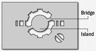
3) Cut out the black bits. If you have a craft knife (only use one if you are old enough to and are confident with one) this shouldn't be too much trouble (remember to use a board so as not to damage the surface you are working on) however with a bit of creativity and blind faith you can also neatly cut out a fiddly stencil with scissors. If you are careful you can make extra incisions into the white of the stencil and then patch them up with the tape (I used a water proof tape and stuck it onto both sides of the stencil for extra security). For example the letters were far too thin and angular for me to cut them out smoothly. By making an extra incision into the white around each letter the scissors had more freedom of movement and could get into all the points.

Remember I talked about magically reattaching the holes (they are officially called 'islands') in the letters? Well I taped thin lines cut from the scraps to create 'bridges'. Here is a much clearer example of what I mean. For extra sturdiness I used toothpicks on the big As.

When the stencil is completed it should look like this when held up to the light:


4) Paint your design onto the back of your shirt!


Spread your shirt out onto a piece of newspaper (so as to protect the surface beneath) - remember to undo the shirt! If you paint onto a buttoned up shirt the paint will go straight through onto the front! If you are painting onto a t-shirt put newspaper / card into the shirt to protect the other side.

Because my shirt was quite flimsy I pinned the stencil onto it to prevent extra folds. I put old padded envelopes between the shirt and newspaper for something for the pins to go into.

Paint on that stencil! I used Dylon Fabric Paint and a small everyday paint brush. Leave to dry.

Once dried you can apply another layer of paint to even the colour out. If you wish to paint with more than one colour paint each colour as a separate layer. Leave each layer to completely dry before painting the next.

Leave to dry again then remove the stencil.

5) Set the paint. This next step depends on the instructions of the fabric paint you used. With Dylon Fabric Paint you must iron the paint to make it permanent. Because my shirt is made of a thin material I put it between two tea towels when I ironed it. Don't use a steam iron!

6) Wear it! Wear it! Wear it!


The cat is called Freya. She actually belongs to the people across the road but prefers it with us lol
 
 
For extra Poison Ivy touches wear the shirt over green and with floral accessories (especially in your hair) though of course all of Batman's greatest foes end up in an Arkham Asylum shirt at some point in their lives so you could also match it with colours and symbols worn by any of your favourite villains!
 
P.S. - I haven't forgotten about my short comic tutorial - I just haven't finished my character designs for the next stage yet. D'oh!

Wednesday, 27 February 2013

D.I.Y. - Trimmed Shirt

Hi guys! Here is a really simple DIY to liven up a plain shirt for dirt cheap! I did this with an ox-blood (maroon) and blue for a very specific reason but monochrome is really popular at the moment and I think this make would look super effective in white and black such these shirts from River Island and Forever 21:

 
You will need:
  • a plain shirt (opaque or semi-transparent)
  • plain ribbon / binding
  • thread the same colour as the ribbon / binding
  • a tape measure to work out how much ribbon / binding you will need
  • a thin sewing needle and pins / a sewing machine
Steps:
 
1) Measure the areas of your shirt you want to line to work out how much ribbon you will need (always allow for extra just in case you make a mistake). I used a 1cm wide ribbon for the front of the shirt and collar and a 3cm wide for around the bottom. Whatever width you choose remember that you will only see half of it as the other half will have been folded round the hem of the shirt.
 
2) Make sure that your ribbon / binding comes as one long piece rather than in short lengths as it will look ugly where you join them. That means that if you are lining the collar and front like I did it will all be ONE piece of ribbon / binding.
 
3) Decide if you are going to use ribbon or binding. I used ribbon because binding didn't come in the colour I wanted. There are pros and cons to both:
  • Ribbon comes in more colours and thicknesses than binding
  • You do not need to hem ribbon
  • Ribbon can be cheaper than binding
  • Ribbon is made of stiff, artificial materials so can be awkward to sew, especially with a sewing machine
  • Binding is purposely designed to hem / line garments and can easily be applied using a sewing machine
  • Binding is not hemmed but is folded so that when you sew it you hem it at the same time
  • You can make your own binding from any cloth but it will not be hemmed and will not be folded - only do this if you are a confident sewer!
  • If you do buy ribbon make sure NOT to buy gift wrap ribbon. It is more expensive and is usually very plasticy / lined with metal so will be hell to sew with and make your garment rigid!
4) Trim your shirt! I hand sewed it because I don't trust myself on a sewing machine and used ribbon. I folded a small length of the ribbon around the hem so that it was equal on both sides of the shirt and pinned it. I then sewed it using a simple but neat back stitch:
 
 
I pinned it a little at a time instead of all in one go so that I didn't sew any bubbles and ruffles into the ribbon or shirt (which can happen if the materials aren't exactly lined up properly when you pin them).
 
 
When lining the collar remember the 'back' of your sewing (eg the messy side) will become the front (the neat side) which is why I say keep your sewing neat!
 
5) Hemming the ends of your ribbon / binding is the only really tricky bit. Fold the end of the ribbon in on itself so that your ribbon just meets the edge of your hem) and then sew it like the rest of your ribbon. It took me a few attempts to fold the ribbon to the right length. I then used some very tiny stitches to hold the end of the ribbon into place so that it didn't unfold itself whilst I focused on keeping the rest of it folded over the hem of the shirt.
 

And there you have one trimmed shirt!
 
CLICK HERE for how to turn your maroon and blue shirt into the shirt Poison Ivy wears in Arkham Asylum and Arkham City!

Monday, 4 February 2013

Recipe: Cherry Frangipane Tart

This year I want to do more makes on Enchanted Blogging so please enjoy my first recipe for you to try: Cherry Frangipane Tart (aka a cherry almond pie).


Ingredients

250g sweet pastry (I used shop bought but here is a recipe if you want to make your own)
50g butter / butter substitute
50g golden caster sugar
1 large beaten egg
65g ground almonds
almond / vanilla extract
1 tbsp cherry / red fruit jam
around 250g pitted cherries

Method
  1. Preheat the oven to 190oC / Fan 170oC / Gas mark 5.
  2. Roll out the pastry on a lightly floured surface (I use a floppy mat - also remember to lightly flour your rolling pin too) and when you have it nice and thin transfer it to your pie tin. Desert pastry can sometimes be quite short and by using a floppy mat I can flop the whole thing over (like when you flop an omelet out of the pan onto your plate) but if you are clever you can lift your pastry into the tin using the rolling pin.
  3. Line the pastry with baking parchment or tin foil then fill with baking beads / dried beans / rice (you cannot eat the beans or rice if you use them to blind bake). Blind bake for no more than 10 minutes so that the wall of the tart case is just cooked. Spoon out the beads and remove the lining. If the bottom of the tart case is still very raw prick with a fork then put back into the oven for another five minutes.
  4. For the frangipane (almond paste) beat the butter and sugar together in a bowl until light a fluffy. Beat in the egg then stir in the ground almonds and extract. I find almond extract is almond overkill so I use vanilla.
  5. Spread a cherry / red fruit jam across the base of the tart so that if lightly covers it. If you want something a bit tangier I really recommend pomegranate molasses.
  6. Next put in a generous layer of cherries. It is okay to use tinned / jarred cherries if cherries are out of season in your area as long as they have been preserved in water (not syrup) and are completely drained (never use defrosted frozen fruit - it retains too much water and makes everything soggy). Of course fresh cherries are best but I really must stress only use them if they are in season. Though it is easy to get fresh cherries all year round cherries that have come from halfway around the world are usually very disappointing in flavour.
  7. Complete the tart by adding the frangipane. It's more than okay if the cherries peek through like in a clafoutis that's perfectly fine!
  8. Bake for 20-25 minutes or until the frangipane is golden and firm. Leave to cool.
Blackberry and pear are other traditional fillings for frangipane tarts. You could also try strawberry or even chocolate ganache (a mixture of melted chocolate and cream)!


Sunday, 23 December 2012

Alternative Gingerbread Men

Somehow my Christmas turned alternative this year...possibly down to the construction of the Sasssquatch Wreath. As part of this alternative Christmas (please feel free to replace Christmas with whatever holiday it is you celebrate this time of the year) please allow me to introduce you to my alternative gingerbread men (plus the sacrificial gingerbread man made to stop mum's boyfriend eating the others during the night......):


Let's play a game! I'll show a picture of each gingerbread man before I show who it is supposed to be and you can see if you guessed right!

Hulk Hogan, brother!

A crime scene chalk outline

Matt Smith as the 11th Doctor Who (something weird happened to his trousers between icing him and taking his photo...I think he went back to the 80s and got them stonewashed!)

Robert Englund as a very happy Freddy Krueger (possibly went back in time with the Doctor...maybe time for Freddy v Doctor Who film?)
 

An Oompa Loompa

Pyramid Head from Silent Hill

Arkham City Riddler <3 <3 <3

Two Face

Zombie
 
This was lots of fun! I'd definitely like to make more! Maybe you guys have someone you'd like to see immortalised in gingerbread? I'd love to see your suggestions! I must say I'm quite tempted to do a whole batch of Batman gingerbread men. Let me know what you think!
 
Oh - and I'll leave you with a riddle from Gingerbread Riddler...


Related Posts Plugin for WordPress, Blogger...